By Clay Shumate
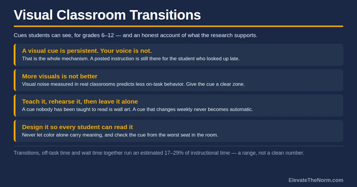
Visual classroom transitions use something students can see — a projected timer, a posted sequence, a slide, a hand signal — to carry the instructions for moving from one activity to the next, instead of your voice carrying them. The point is not decoration. It is that a visible instruction stays available after you have stopped talking, and a spoken one does not.
That distinction is the whole article. Most transition advice tells you to be clearer. Visual cues are a structural fix rather than a delivery fix: they change where the instruction lives, so a student who missed it, tuned out for ten seconds, or is still finishing a sentence can recover without asking you or asking the person next to them.
Key Takeaways
- A visual cue is persistent; your voice is not. That is the entire mechanism. Anything a student can look back at removes a reason to ask a neighbor, and asking a neighbor is how a thirty-second transition becomes ninety.
- Transitions are a real time cost, and the honest number is a range. Estimates put off-task behavior, transitions and wait time at somewhere between 17 and 29 percent of instructional time.
- More visuals is not better. The same literature that supports visual cues also finds that visual clutter predicts less on-task behavior — and that finding has a published reanalysis you should know about.
- The evidence base is strong for some students and thin for whole classrooms. Visual schedules are well supported for students with intellectual disability and autism. Nobody has shown a general secondary-classroom effect.
- One permanent cue beats five clever ones. The cue only works once it is automatic, and a cue that changes weekly never becomes automatic.
Free Download · PDF
Classroom Transitions Planning Toolkit
A transition audit sheet, a cue-type guide, and a planning template for building and timing the three moves that cost you the most.
Free. No email address required. Designed for grades 6–12. Browse every printable in Your Free Library.
What Counts as a Visual Classroom Transition?
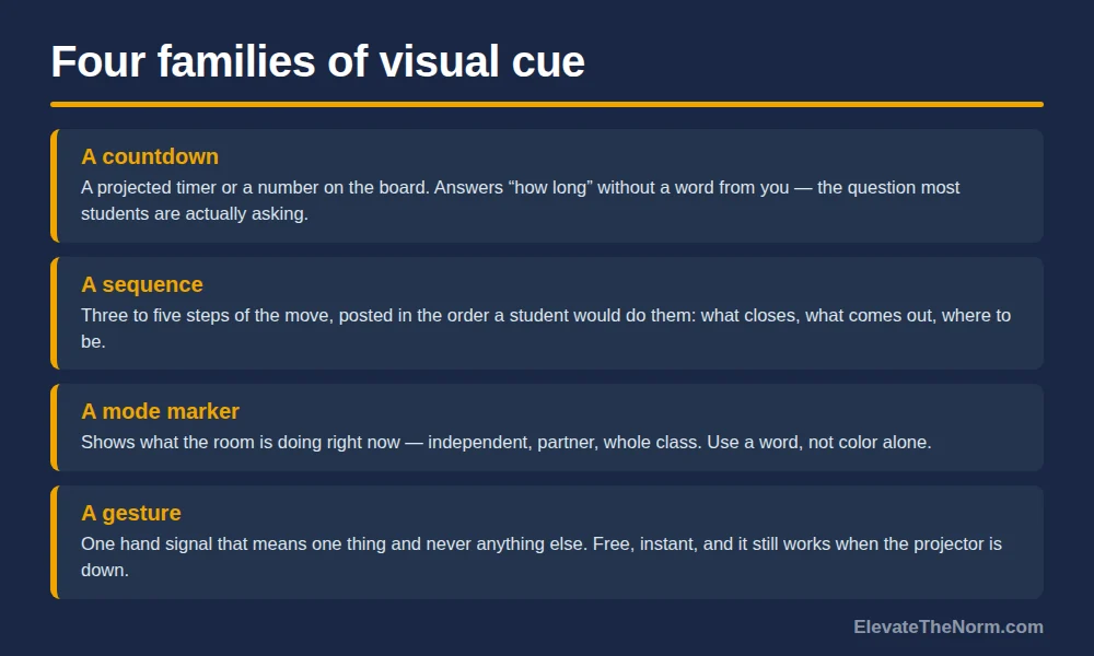
Anything a student can look at that tells them what happens next, where to be, and how long they have. Four families cover almost everything worth using in a secondary room:
- A countdown. A projected timer, or a number on the board you change. It answers “how long” without a single word from you, and “how long” is the question most students are actually asking.
- A sequence. The steps of the move, posted or projected: what to close, what to get, where to sit. Three to five steps, in order, in the order a student would do them.
- A state signal. Something that shows what mode the room is in right now — a colored slide, a magnet on the board, a word in the corner of the projection. Silent work, partner talk, whole class.
- A gesture. A hand signal that means one specific thing and never means anything else. Free, instant, and the only one that works when the projector is down.
What does not count: a decorative poster nobody reads, a slide so crowded that finding the instruction takes longer than hearing it, and a sign that has been up since August and has therefore become furniture.
Visual cues sit inside the broader practice of managing classroom transitions, and they are one signal among several. They pair naturally with an audio cue — the music and sound cue guide covers that half — and the pairing is often better than either alone, because one catches the student who is looking up and the other catches the student who is not.
How Much Time Do Transitions Actually Cost?
Enough to matter, and less precisely than most articles claim. Anyone quoting you a clean figure is rounding somebody else’s estimate.
The most careful recent synthesis is Kraft and Novicoff’s 2024 paper on time in school. Reviewing the available studies, they report that estimates of off-task behavior, transitions and wait time together occupy between 17 and 29 percent of instructional time — a range, drawn from several different measurement methods, and covering three things at once rather than transitions alone.
Their own district analysis is more concrete and more sobering. In Providence Public Schools they found instructional time lost running at 16 percent in elementary, 21 percent in middle school and 25 percent in high school. The largest single contributor was unexcused absence, followed by outside interruptions and teacher absence; interruptions and teacher absence alone cost the average high school student 97.3 hours a year.
Read that honestly. Those Providence figures are not a transition statistic. They count absence and building-level interruption, and the authors explicitly call the estimate a lower bound that does not capture how usable hours are further eroded by disruptions inside the classroom. The transition number lives inside the 17-to-29 percent range, and that range is wide because the measurement is hard.
What you can say without overstating: transitions are a nontrivial recurring cost, they are one of the few losses a single teacher can act on without anyone’s permission, and a room that moves in thirty seconds instead of ninety recovers real minutes across a semester. That is a good enough reason. It does not need inflating.
Why Does a Visual Cue Work Better Than Saying It Again?
Because it is still there after you stop talking. A spoken instruction exists for about four seconds and then only in the memory of whoever was listening. A projected one is available to the student who looks up late.
That sounds small. It is the entire difference, and you can watch it happen: the student who missed the instruction turns to a neighbor, the neighbor stops working to answer, and one missed instruction has now taken two students off task and generated the noise that pulls a third. A visible instruction gives that student a way to recover without recruiting anyone.
It also tells you who benefits most, and it is not the student you were picturing. It is the one who was absent yesterday and does not know the routine, the one who needs a few extra seconds to process a spoken instruction, and the one who will not ask you a question in front of the room under any circumstances. All three are students a voice-only transition leaves behind, and none of them will tell you so.
There is a second effect, harder to see. Instructions delivered only by voice make you the sole source of the answer, so every uncertainty routes through you. That is what makes a transition feel like crowd control. Moving the instruction onto the wall or the screen means the room can answer its own question, which is the same principle behind writing down classroom routines and procedures rather than re-explaining them.
The research on the cueing side is worth being precise about, because it is frequently overstated. Visual activity schedules have a real evidence base: van Dijk and Gage’s 2019 meta-analysis in the Journal of Intellectual & Developmental Disability pooled 13 single-case studies and found a meaningful effect on independent skills, across middle school, high school and adult participants. Milam and Sutton’s 2024 article in Beyond Behavior extends the practice to students with emotional and behavioral disorders as a proactive transition strategy, at the elementary and middle school level.
Notice what that evidence is and is not. It is single-case research with students who have identified disabilities. It is good evidence that visual schedules help those students become more independent. It is not evidence that adding a projected timer raises achievement in a general-education eleventh-grade classroom, and nobody should tell you it is. The honest case for visual cues in a mainstream secondary room is mechanical and modest: it costs nothing, it removes a known friction point, and the practice it generalizes from is well supported for the students who need it most.
There is one adjacent evidence-based practice worth naming, because it is cheap and it pairs with every cue on this page. Ennis, Royer, Lane and Griffith’s 2017 systematic review in Education and Treatment of Children applied Council for Exceptional Children standards to precorrection — telling students what is about to be expected, before the moment arrives — and concluded it qualifies as an evidence-based practice. A visual cue is a precorrection you did not have to say.
Does More Visual Support Make a Room Work Better?
No, and this is the part most articles about classroom visuals leave out. The same research tradition that supports targeted visual cues also finds that a visually busy room costs attention.
Godwin, Seltman, Scupelli and Fisher observed 58 elementary classrooms with a structured on-task protocol and analyzed panoramic photographs of each room’s visual environment. Students were on task 72.7 percent of the time. Greater visual noise significantly predicted less on-task behavior — each standard deviation increase in visual noise was associated with roughly a 10 percent reduction in the odds of being on task. Adherence to design-composition principles predicted nothing. Peer distraction, incidentally, accounted for 46.4 percent of all off-task behavior, which is worth remembering the next time a seating decision seems minor.
The better-known version of this finding comes from Fisher, Godwin and Seltman’s 2014 study in Psychological Science, where kindergarteners in a heavily decorated room were more distracted and scored lower than the same children in a sparse one. It is quoted constantly. It also has a published reanalysis that you should know about before you quote it. Imuta and Scarf, writing in Frontiers in Psychology the same year, reanalyzed the data and found that children’s distraction in the decorated room decreased considerably across lessons — habituation. Their argument is that the study conflated novelty with irrelevance, and that 45 minutes total across two weeks is nowhere near enough time to habituate the way students do to a real classroom they sit in daily.
So the strong claim — decorations harm learning — does not survive contact with the reanalysis. Two weaker claims do survive, and both are useful: visual noise measured in real classrooms predicts less on-task behavior, and novel visual material draws attention. Both point the same direction for transitions. If everything on your walls is competing, the one thing you actually need students to look at is competing too. And because novelty is what draws the eye, a cue that appears only at transitions has an advantage over one that is always up.
The caveat on all of it: these are K–4 samples. A sixteen-year-old is not a kindergartener, and no equivalent study of secondary classrooms turned up here. Treat this as a reason to keep the signal clean, not as a proven high school effect.
How Do You Build a Visual Cue That Actually Gets Used?
Five steps, and step four is the one that decides whether it works.
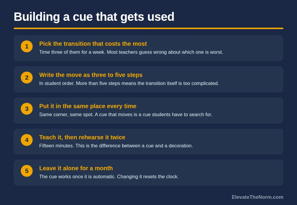
- Pick the transition that costs you the most. Not all of them. Time three of them with your phone for a week — entry, the move into group work, and the last five minutes — and fix the worst one first. Most teachers guess wrong about which one it is.
- Write the move as three to five steps, in student order. What closes, what comes out, where people go. If it takes more than five steps, the transition itself is too complicated and no cue will save it.
- Put the steps and a countdown in the same place every time. Same corner of the slide, same spot on the board. A cue that moves is a cue students have to search for, and searching is the cost you were trying to remove.
- Teach it, then rehearse it twice. Show the cue, walk the steps, do it once badly and name what went wrong, do it again. This is fifteen minutes and it is the entire difference between a cue and a decoration. A visual nobody has been taught to read is wall art.
- Leave it alone for a month. The cue works when it is automatic, and automatic takes repetition. Changing it because you thought of a better version resets the clock.
Two practical notes. Make the cue legible from the worst seat in the room — back corner, at an angle, with the lights on. Text that reads fine on your laptop frequently does not survive the projector, and a student who cannot read the cue will ask a neighbor, which is the exact behavior you were trying to prevent. Check it from that seat once.
And have a version that works when the technology does not. Projectors fail, and plenty of secondary teachers float between rooms or share a space where the board is not theirs to write on. A hand signal plus three steps on a half sheet at each table, or on a single laminated card you carry, covers the same ground and needs no bulb and no wall. If your whole transition system depends on a screen you do not control, you have built a system that breaks on the morning the network is down — which is the same reason a room needs a procedure a substitute could run without you in the building.


What Do Visual Cues Look Like in a Secondary Classroom?
Plainer than the internet suggests. Most published visual-transition material is built for elementary rooms, and a fourteen-year-old reads a cartoon carpet-time card as an insult. The design rule for grades 6–12 is that the cue should look like something adults use.
Worth using:
- A full-screen countdown for any move with a deadline. No decoration, large numerals, visible from the back.
- A three-line slide that appears only during a transition and shows what closes, what opens, and where to be.
- A mode marker in a fixed corner of the slide — independent, partner, whole class. Use a word, not a color alone. Roughly one boy in twelve has a red–green color vision deficiency, so a red-versus-green block is a cue a few students in every section cannot read. A colored block with the word on it works for everyone, and it ends the “can we talk?” question permanently.
- A two-finger signal that means one thing: thirty seconds left. One gesture, one meaning, used every day.
- A materials diagram for any recurring setup with a physical arrangement — lab stations, a debate layout, group clusters. Drawn once, reused all year.
Worth skipping: animated slide transitions, anything with a cartoon character, a different cue for every activity, and a countdown with sound effects. All of them add novelty to a moment that needs predictability.
One more: the cue should not require you to be at the front of the room. The value of a visual signal is that it frees you to move — to be next to the group that always stalls, instead of at the board narrating. If your system requires you to stand somewhere and press something, you have built a cue that costs you the thing it was supposed to buy.
Where Visual Transitions Break Down
Four failure modes, all predictable, all cheaper to avoid than to fix.
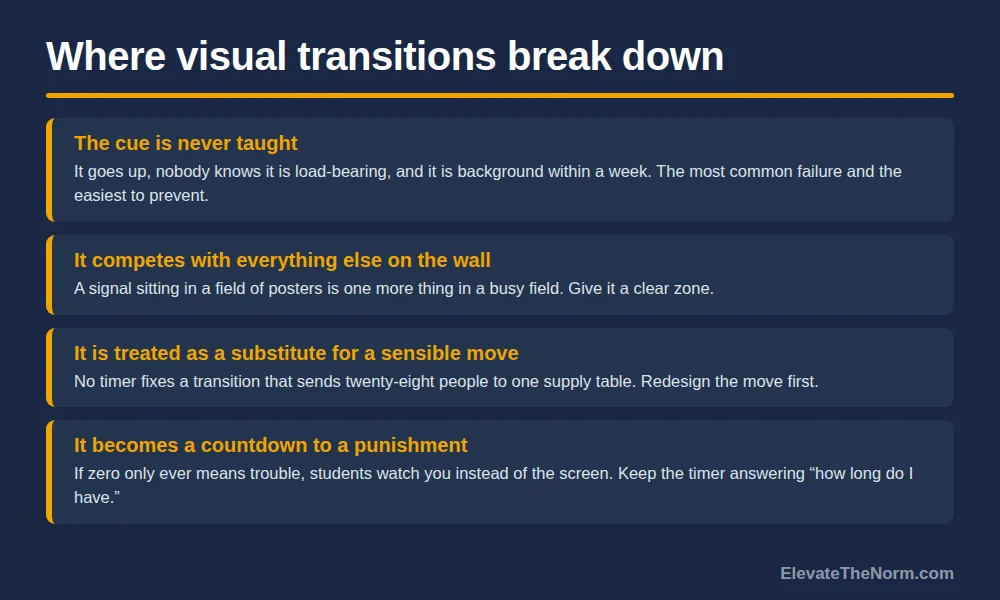
The cue is never taught. It goes up, students do not know it is load-bearing, and it becomes background within a week. This is the most common failure and the easiest to prevent: fifteen minutes of explicit instruction and two rehearsals.
The cue competes with everything else on the wall. This is the visual-noise finding applied to your own room. If the signal sits in a field of posters, student work and reference charts, it is one more thing in a busy field. Give it a clear zone with nothing around it.
The cue is treated as a substitute for the transition being sensible. No timer fixes a move that requires twenty-eight people to cross the room to a single supply table. Redesign the move first. A visual cue makes a good procedure faster; it cannot make a bad one work.
The cue becomes a countdown to a punishment. If the timer’s only meaning is that something unpleasant happens at zero, students learn to watch you rather than the screen, and the cue has acquired a tone you did not intend. The timer answers “how long do I have,” which is a fair question a student is entitled to ask. Keep it answering that.
What to Do This Week
Time your three worst transitions for a week and write the numbers down. Pick the slowest one. Write that move as four steps in the order a student would do them, put those steps plus a countdown in one fixed spot, and spend fifteen minutes teaching it with two rehearsals. Then leave it alone for a month and time it again.
While you are at it, look at the wall behind the cue and take down anything that is not doing work. That is the one piece of advice in this article with direct classroom observation behind it, even if the classrooms were younger than yours.
Visual classroom transitions will not transform a room. What they do is remove one specific friction — the gap between when you said the instruction and when a student needed it — and hand students a way to solve their own problem without asking anybody. That is worth fifteen minutes and a slide. For the concrete versions, the transition examples and free planning toolkit includes a cue guide and an audit sheet for timing the moments that leak the most.
Before you go: grab the free Classroom Transitions Planning Toolkit (PDF) — ElevateTheNorm.com branded, printable, no email required.
Frequently Asked Questions
Do visual transition cues work with high school students, or are they an elementary thing?
The design has to change; the mechanism does not. A sixteen-year-old reads a cartoon cue card as condescension and will treat it accordingly. A full-screen countdown, a three-line slide and a hand signal are the same tool in a form that looks like something adults use. Be aware that the research base is mostly elementary and mostly students with identified disabilities — there is no study here showing a general effect in a mainstream high school classroom. The case for using them at this level is that they cost nothing and remove a known friction, not that they are proven.
Isn’t a timer just pressure? Some of my students get anxious about it.
A timer is pressure when zero means something bad happens. It is information when zero means the next thing starts. Two things keep it on the information side: say what happens at zero before you start it, and make sure what happens at zero is a transition rather than a consequence. If a particular student finds a visible countdown genuinely difficult, a posted sequence without a clock does most of the same work — the persistence of the instruction is the part that matters, not the ticking.
How many visual cues should a classroom have?
Fewer than you think. One for time, one for the sequence, one for mode, and one gesture is a complete system, and most rooms would do better with two of those used consistently than four used occasionally. The observational research on visual noise points the same way: more visual material in a room predicts less on-task behavior, so every additional cue is competing with the ones you actually need.
Does this mean I should take everything off my classroom walls?
No, and the study that gets quoted for that claim has a published reanalysis worth knowing about. Fisher, Godwin and Seltman found kindergarteners more distracted in a decorated room — but Imuta and Scarf reanalyzed the data and showed the distraction dropped considerably across lessons, which points to novelty rather than decoration as the cause, in a setting where children never had time to habituate. The defensible version is narrower: keep a clear zone around the cue you need students to read, and take down what is genuinely doing no work. Student work on the walls is doing work.
What do I do when the projector dies mid-transition?
Have the analog version ready before it happens, because it will. A hand signal that means thirty seconds and four steps written on the board in marker do the same job and never need a bulb. Teach the backup at the same time you teach the main cue so it is not a novelty on the day you need it. Any transition system that only works when the technology works is a system that fails on exactly the mornings that are already going badly.
Should students help design the cue?
It is worth asking them which transition is worst and what the current cue does not tell them. They are the ones experiencing the ambiguity and they will name things you cannot see from the front — the slide is unreadable from the back row, or nobody knows whether the move includes getting a laptop. Take their information and keep the design decision. A cue that changes because of student preference every few weeks never becomes automatic, and automatic is the whole point.
How do I make sure a visual cue is readable for every student?
Three checks, none of which takes long. Sit in the worst seat in the room — back corner, off angle, lights on — and read the cue yourself; projector contrast is much worse than laptop contrast. Never let color alone carry meaning, because a red-versus-green signal is unreadable for the students in every section with a color vision deficiency; put the word on the block. And say the cue out loud the first few times you use it, which covers a student with low vision and costs you four seconds. A cue that a few students cannot read is worse than no cue, because those students now have to ask someone.
How long before a new visual cue actually starts saving time?
Expect a few weeks, and expect the first several days to look worse rather than better, because students are learning a new routine on top of doing the old one. Time the transition before you start so you have a real baseline, then time it again after a month. If nothing has improved after a month of consistent use, the problem is almost certainly the transition itself rather than the cue — a move with too many steps or a physical bottleneck will not be fixed by putting a timer on it.
Sources
- Kraft, Matthew A., and Sarah Novicoff. “Time in School: A Conceptual Framework, Synthesis of the Causal Research, and Empirical Exploration.” EdWorkingPaper, February 2024. https://edworkingpapers.com/sites/default/files/Kraft Novicoff – Time In School – Feb 2024_1.pdf
- Godwin, Karrie E., Howard Seltman, Peter Scupelli, and Anna V. Fisher. “Attentional Competition in Genuine Classrooms.” Proceedings of the 42nd Annual Meeting of the Cognitive Science Society, 2020. https://cognitivesciencesociety.org/cogsci20/papers/0524/0524.pdf
- Imuta, Kana, and Damian Scarf. “When too much of a novel thing may be what’s ‘bad’: commentary on Fisher, Godwin, and Seltman (2014).” Frontiers in Psychology, vol. 5, art. 1444, 2014. https://www.frontiersin.org/journals/psychology/articles/10.3389/fpsyg.2014.01444/full (The Fisher, Godwin and Seltman 2014 Psychological Science study is described here as reported in this commentary and in the Godwin et al. 2020 paper above; the original article was not read directly.)
- van Dijk, Wilhelmina, and Nicholas A. Gage. “The effectiveness of visual activity schedules for individuals with intellectual disabilities: A meta-analysis.” Journal of Intellectual & Developmental Disability, vol. 44, no. 4, 2019, pp. 384–395. https://eric.ed.gov/?id=EJ1234224
- Milam, Molly E., and Kimberly Kode Sutton. “Using Visual Activity Schedules to Improve Transitioning for Students With Emotional and Behavioral Disorders.” Beyond Behavior, vol. 33, no. 3, 2024. https://journals.sagepub.com/doi/10.1177/10742956241276003
- Ennis, Robin Parks, David James Royer, Kathleen Lynne Lane, and Claire E. Griffith. “A Systematic Review of Precorrection in PK-12 Settings.” Education and Treatment of Children, vol. 40, no. 4, 2017, pp. 465–495. https://eric.ed.gov/?id=EJ1157923